
The 60-30-10 Color Rule: The Simple Secret to a Beautifully Balanced Home
The Weekly Interior by Caroline Lauzon
Ever walk into a room and wonder why everything just works?
The furniture doesn’t perfectly match. The colors aren’t identical. Yet somehow, the entire space feels calm, cohesive, and intentionally designed.
One simple interior design trick may be behind it: the 60-30-10 color rule.
This easy formula helps you create a balanced color palette without making your home feel overly coordinated—and you don’t need to be an interior designer to use it.
What Is the 60-30-10 Color Rule?
The idea is simple: divide the colors in your room into three proportions.
🎨 60% — Your Dominant Color
This is the main color that sets the overall mood of the room.
You'll usually see it across larger surfaces such as:
- Walls
- Large rugs
- Sofas
- Major furniture pieces
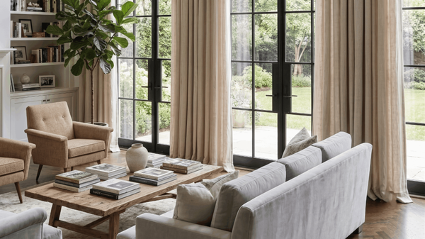
For a warm, timeless interior, this might be soft white, cream, beige, or warm greige.
Think of this 60% as the backdrop for everything else.
🌿 30% — Your Secondary Color
Your secondary color adds contrast and depth without competing with the dominant shade.
You might introduce it through:
- Accent chairs
- Curtains
- Bedding
- Wood furniture
- Cabinetry
- Larger decorative pieces
For example, a room with warm white walls could use natural wood or muted olive tones as its secondary color.
The goal is contrast—not competition.
✨ 10% — Your Accent Color
Now comes the fun part.
The final 10% adds personality and helps pull everything together.
Accent colors work beautifully through smaller details like:
- Throw pillows
- Artwork
- Vases
- Lamps
- Decorative objects
- Hardware
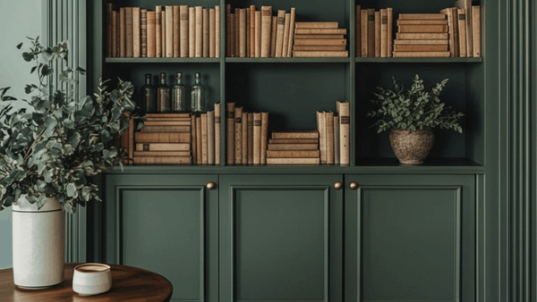
A mostly neutral room, for example, might use matte black, deep green, rust, or brushed brass for that final touch of contrast.
Because it only represents a small portion of the room, this is also the easiest color to change whenever you want a fresh look.
The Formula Doesn't Have to Be Exact
Don't worry—you don't need to measure your room and calculate exactly 60%, 30%, and 10%.
Think of the rule as a visual guideline rather than a strict mathematical formula.
The dominant color should clearly lead the room, the secondary shade should support it, and the accent should appear just enough to create interest.
That's what gives a space balance without making everything match.
Try Different 60-30-10 Color Combinations
The same formula can create completely different moods.
Warm & Organic
60%: Cream
30%: Natural wood
10%: Olive green
Modern & Minimal
60%: Warm white
30%: Greige
10%: Matte black
Earthy & Cozy
60%: Soft beige
30%: Warm brown
10%: Terracotta
You can also use different textures within each color family—like linen, wood, stone, and woven materials—to make the room feel more layered.
Why This Works for Home Staging, Too 🏡
A balanced color palette isn't only about making your home beautiful.
It can also help when preparing a property for photos or showings.
A cohesive palette can make rooms feel:
- More polished
- Less visually cluttered
- Warmer and more inviting
- Easier to photograph
If resale is the goal, consider keeping your dominant colors relatively neutral while adding personality through the secondary and accent layers.
That way, buyers can still imagine making the space their own.
Create Balance Without Making Everything Match
The beauty of the 60-30-10 decorating rule is its simplicity.
You don't need matching furniture or a completely neutral home. You simply need enough repetition and contrast to make the different elements feel connected.
Start with your dominant color, layer in a complementary secondary shade, and finish with a small accent that adds personality.
Sometimes, creating a beautifully styled room really can be as simple as 60 + 30 + 10. 🤍✨
Categories
Recent Posts





GET MORE INFORMATION